Conversion-focused web development treats a website as a sales tool, not a brochure. Traffic only matters if visitors take the next step. This guide covers the development and design decisions that most affect conversions, based on the lead generation and e-commerce sites we build at Savoir Management.
Why do conversions matter more than traffic?
Doubling traffic to a site that converts 1% gives the same result as doubling the conversion rate on existing traffic, but improving conversions also lowers the cost of every future visitor from ads and SEO. Conversion rate is the multiplier on all other marketing.
Traffic graphs feel good, but you cannot pay employees with page views.

What is the first thing visitors need to see?
Visitors need to understand what you offer, who it is for and what to do next within seconds. Put a specific headline, a one-line value proposition and a single primary call to action above the fold.
Nielsen Norman Group found that users often leave web pages within 10 to 20 seconds, but a clear value proposition can hold attention far longer. Replace vague slogans with outcomes: "Get more booked appointments from your website" beats "Innovative digital solutions."
Which website mistakes kill conversions?
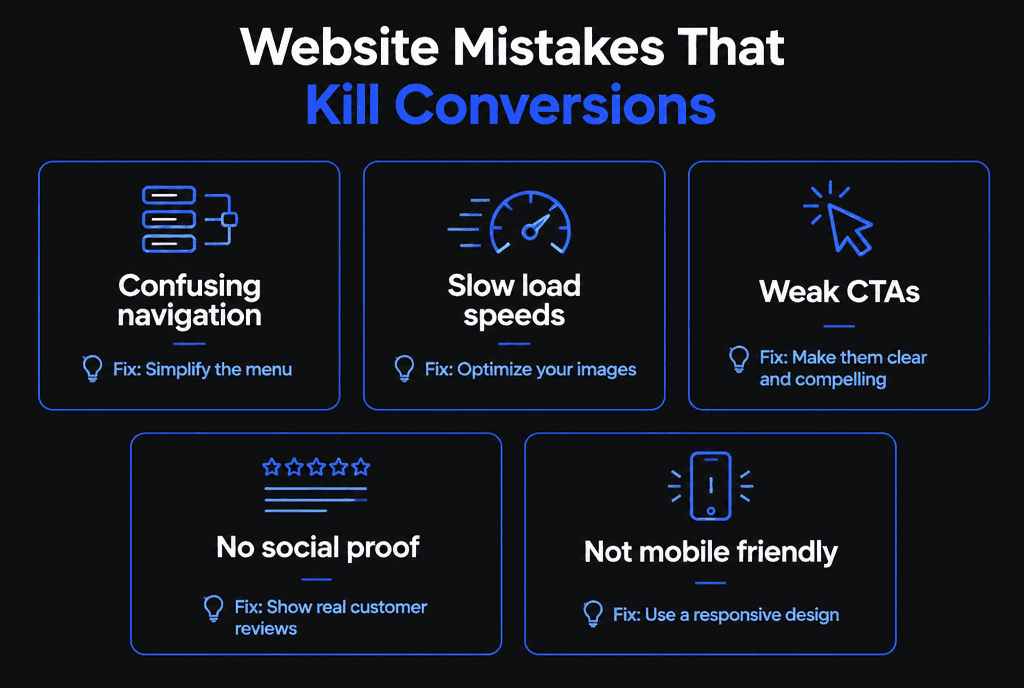
Confusing navigation, slow loading, weak calls to action, missing social proof and poor mobile experience are the five mistakes we fix most often.
How should calls to action be designed?
Use one primary call to action per page, phrase it as the benefit ("Get my free quote"), make it visually dominant and repeat it after key sections. Secondary actions should look secondary.
Place the primary CTA above the fold and after proof sections.
Use action-specific labels instead of "Submit."
Reduce competing links near the CTA.
How do forms affect conversion rates?
Every extra field adds effort, so ask only for what you need to follow up. Short forms with clear labels, inline validation and a visible privacy note convert better.
Follow accessibility basics from WCAG: visible labels, helpful error messages and keyboard support. On checkout, Baymard Institute puts the average documented cart abandonment rate at 70.22%, with complicated checkouts among the reasons shoppers leave.
How do UX and psychology influence conversions?
People act when they understand the offer, trust the business and see low risk. Clear hierarchy, consistent design, social proof, guarantees and transparent pricing reduce uncertainty.
Nielsen Norman Group's 10 usability heuristics, such as visibility of system status and error prevention, are a practical checklist for reviewing pages.

Why does speed matter for conversions?
Slow pages lose visitors before they see your offer. Meeting Core Web Vitals targets keeps pages fast, responsive and stable while people decide.
Google's Web Vitals targets are LCP within 2.5 seconds, INP of 200 milliseconds or less and CLS of 0.1 or less. Read our guide to improving site speed.
How should a conversion-focused site work on mobile?
Design for thumbs first: tap-friendly buttons, click-to-call, short forms, sticky CTAs and fast pages. Most visits now happen on phones.
Pew Research Center reports 91% of U.S. adults own a smartphone. See our guide to mobile-responsive web development.
How do you measure and improve conversions?
Define conversion events, track them in analytics, review funnels to find drop-offs and test changes one at a time. Improvement is a monthly routine, not a launch task.
Set up Google Analytics with recommended events like generate_lead and purchase. Review:
Conversion rate by page and traffic source
Form start versus form completion
Mobile versus desktop conversion
Pages with high exits before the CTA
How does social proof increase conversions?
Social proof reduces risk for visitors who do not know you yet. Reviews, ratings, client logos, case studies and certifications placed near decisions help people feel confident enough to act.
The most persuasive proof is specific and relevant. "Great service" is weak; "They fixed our heating the same day and the price matched the quote" is strong. Place proof where doubt appears: next to forms, beside prices and near the final call to action. Show the reviewer's name and context where you have permission, and keep reviews current, because old testimonials suggest a business has gone quiet.
How does copywriting affect conversions?
Clear copy that speaks to the visitor's problem and desired outcome converts better than clever slogans or lists of features. Every headline, button and form label is part of the conversion path.
Nielsen Norman Group's research on the F-shaped reading pattern shows that people scan pages, so front-load important words in headings and paragraphs. Practical rules:
Lead with the outcome the visitor wants, then explain how you deliver it
Use the words customers use, taken from reviews, emails and sales calls
Replace vague buttons like "Submit" with specific ones like "Get my quote"
Answer objections, such as price, timing and risk, before visitors have to ask
How do you prioritize conversion improvements?
Start where the most visitors drop off on the way to a sale. Improve high-traffic pages with low conversion rates first, and fix obvious friction before testing subtle design changes.
A simple scoring method rates each idea on potential impact, confidence based on evidence and effort. Fixing a broken mobile form scores high on all three; changing a button color scores low on impact. Review analytics, session recordings and customer feedback to generate ideas, then work through them in score order.
How do you run tests on a site with modest traffic?
Test bigger changes, such as a new headline, offer or page structure, rather than tiny tweaks, and run tests long enough to collect meaningful results. When traffic is too low for formal tests, make evidence-based changes and compare longer periods.
Small sites rarely reach statistical significance on minor changes. Focus on changes large enough to matter, measure over several weeks and keep notes so you can connect results to changes. Qualitative research, such as asking five customers to complete a task while thinking aloud, often reveals the biggest problems quickly; Nielsen Norman Group's guide to usability testing explains how.
How do conversion optimization and SEO work together?
SEO brings the right visitors and conversion optimization turns them into customers. Pages that answer searchers' questions clearly and offer a relevant next step tend to perform well on both.
Avoid trade-offs that hurt one for the other, such as hiding important content behind tabs or using intrusive pop-ups. Align each page's search intent with its call to action: an informational article might offer a guide or checklist, while a service page asks for a quote or booking. Our guide to SEO-optimized web development covers the search side.
How do you reduce friction in checkout and booking?
Remove unnecessary steps and fields, show all costs early, offer guest options, support autofill and wallet payments and confirm the next step clearly. Every extra action loses a share of people.
Baymard Institute's research on checkout form fields found that the average checkout had 11.3 form fields in 2024 and that 17% of shoppers had abandoned an order because the checkout was too long or complicated. The same principle applies to booking and quote forms: ask only for what you need now, collect the rest later, and make errors easy to fix. Test the flow on a phone as a first-time customer would, and watch where you hesitate.
What does a conversion-focused page structure look like?
A clear headline and call to action at the top, benefits and proof in the middle, answers to objections near the end and a final call to action. Each section should move visitors closer to the decision.
This structure works because it follows how people decide: understand the offer, believe it, resolve doubts, then act. Our guide to high-converting landing pages explains each section in detail.
What is the ROI of conversion-focused development?
Because conversion improvements apply to all traffic, even small lifts compound. Moving from 2% to 3% on 2,000 monthly visitors adds 20 leads a month without spending more on ads.
Related guides: landing pages that convert, UX-driven development and turning your website into a lead generation machine. Our web development team builds every site around conversion goals.